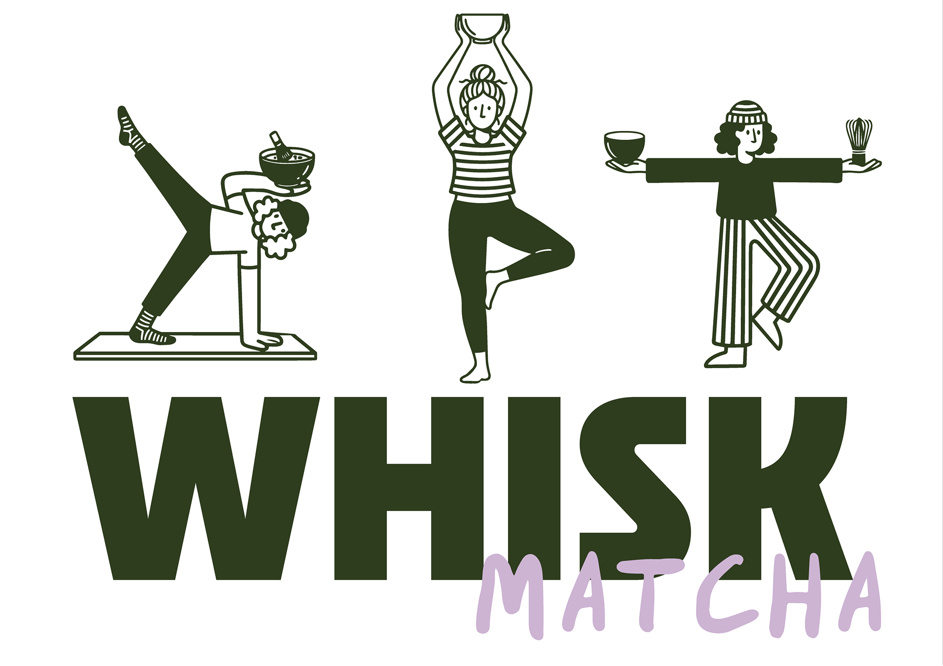
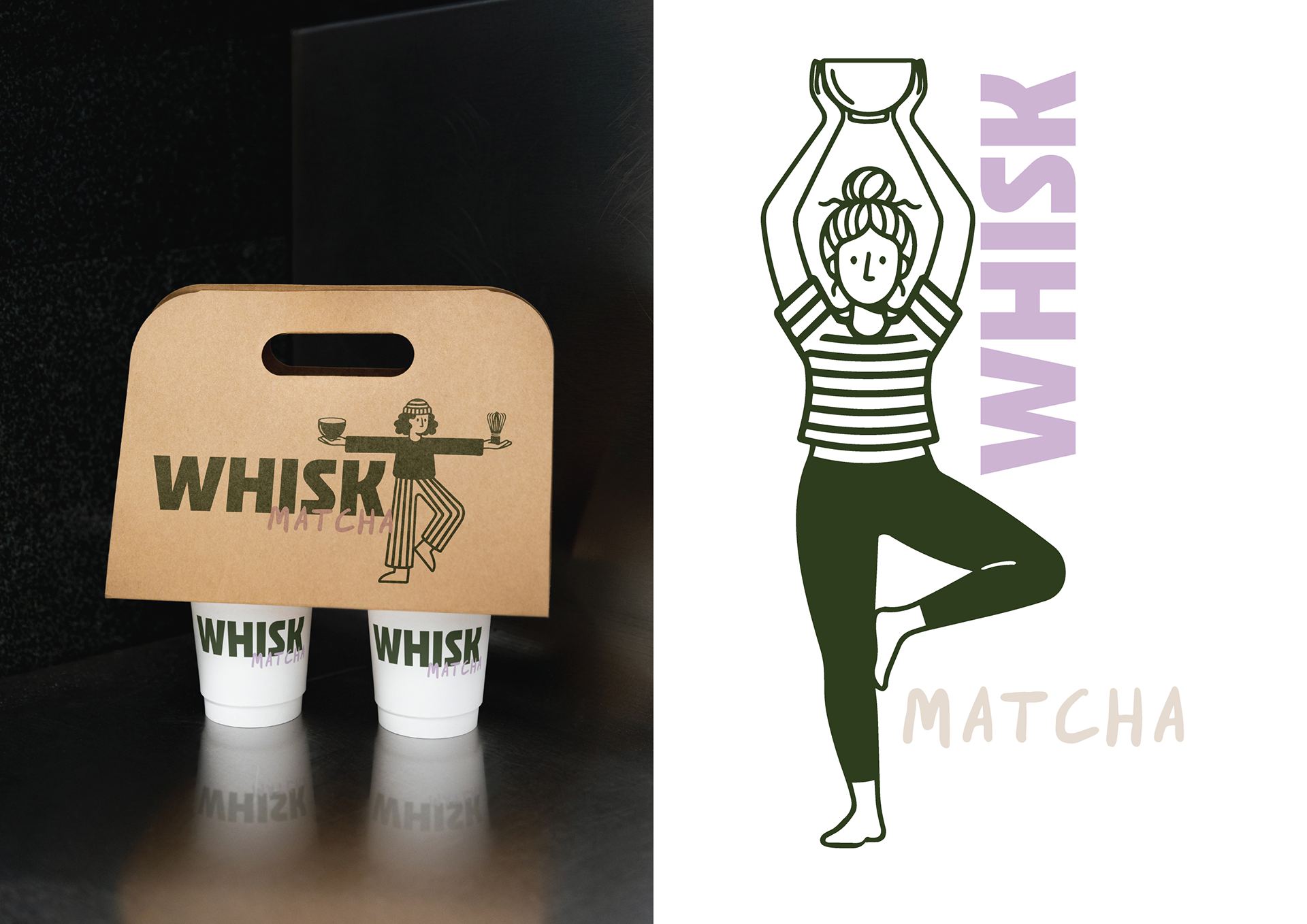
Meet Whisk!
Whisk is a matcha brand and café concept for people who like their mornings calm, playful, and a little bit chaotic. It’s energising without the intensity, wellness without the guilt, and routine without the boredom.
Designed for quick pop-ins before work, Pilates, or whatever the day throws at you, Whisk brings personality to matcha through fun flavours, tactile tools, and an effortlessly cool café experience.
The Idea
Whisk lives in the balance between chaos and calm.
It romanticises everyday rituals — the rushed morning, the takeaway cup, the quiet moment before the day kicks off.
It romanticises everyday rituals — the rushed morning, the takeaway cup, the quiet moment before the day kicks off.
This is matcha for people who want to feel good, but still have fun doing it.
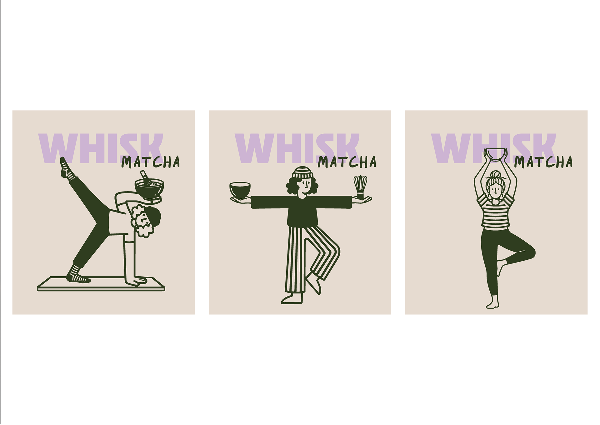
The Look & Feel
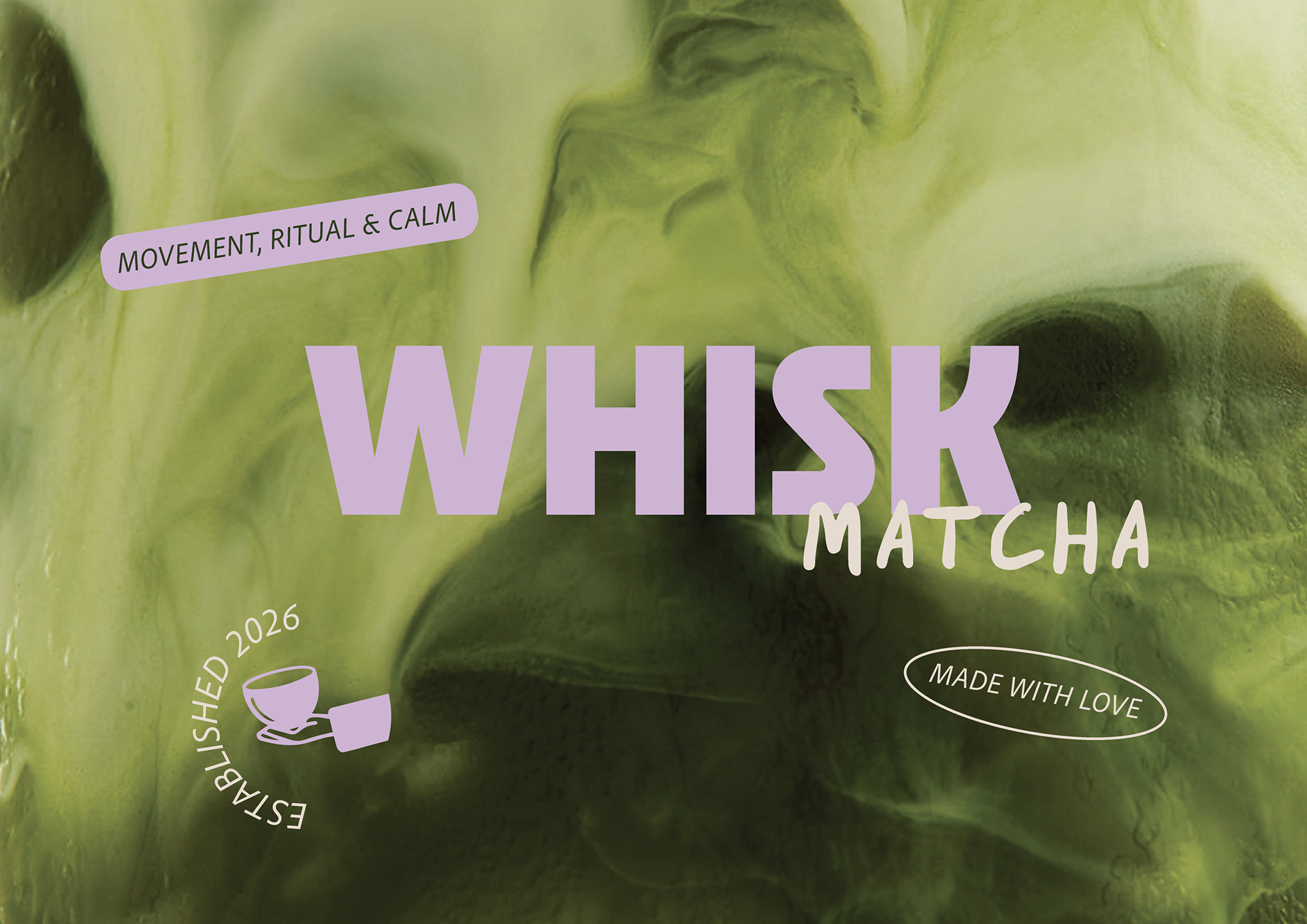
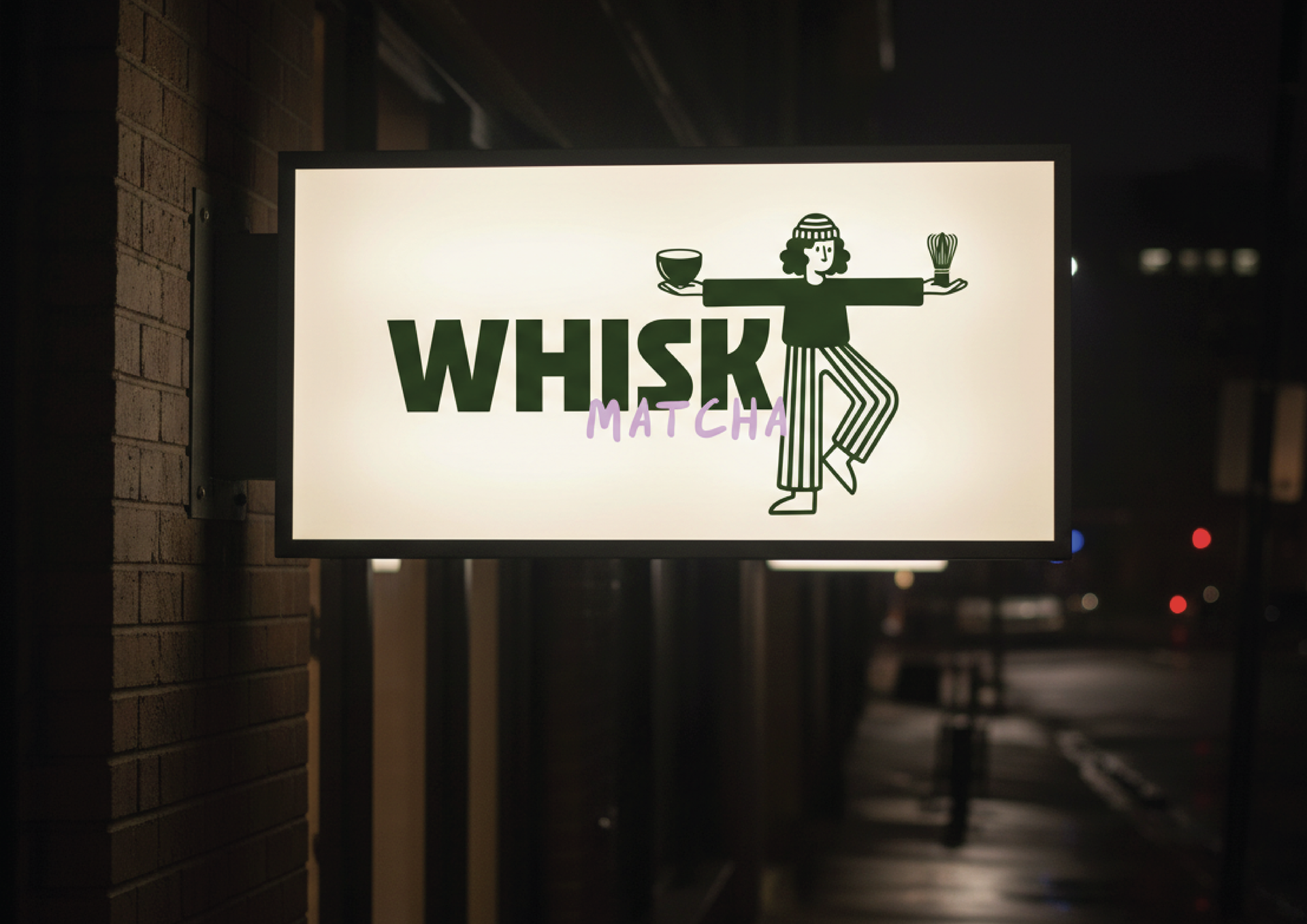
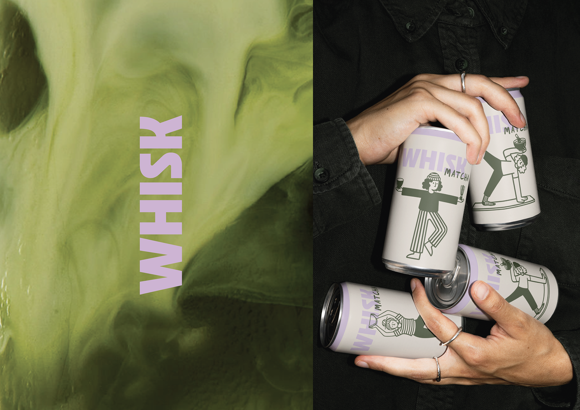
The visual identity blends earthy tones with soft, playful accents inspired by café culture and slow mornings.
A warm, matcha-led colour palette keeps the brand grounded, while hand-drawn illustration and friendly typography add personality and movement.
A warm, matcha-led colour palette keeps the brand grounded, while hand-drawn illustration and friendly typography add personality and movement.
Nothing feels too polished. Nothing feels too serious.
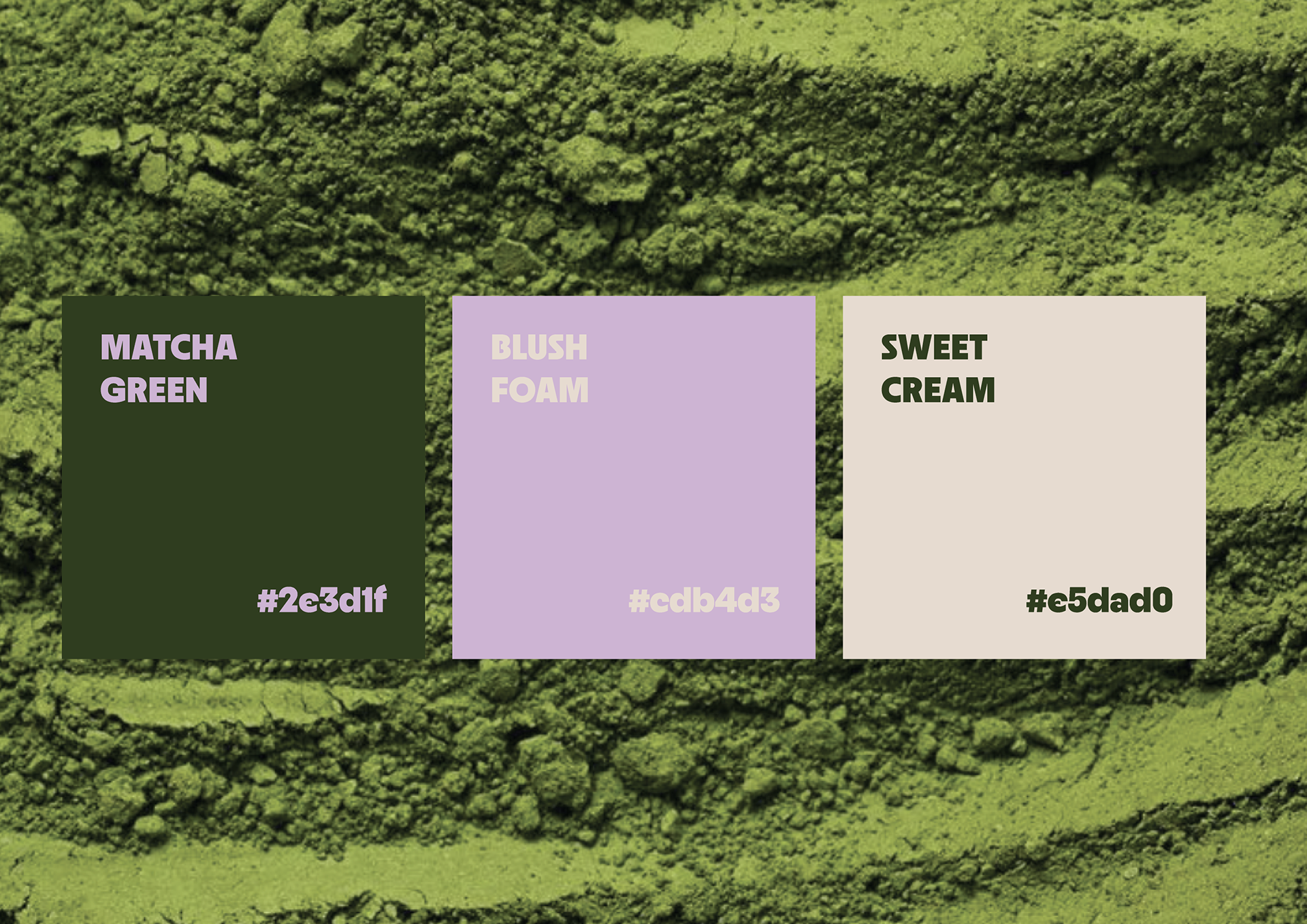
Colour Palette
Ceremonial Matcha, Strawberry Milk, and Oat Milk form a café-inspired palette that feels familiar, calming, and energising.
The colours are designed to work across packaging, cups, signage, and social — instantly recognisable and highly shareable.
The colours are designed to work across packaging, cups, signage, and social — instantly recognisable and highly shareable.
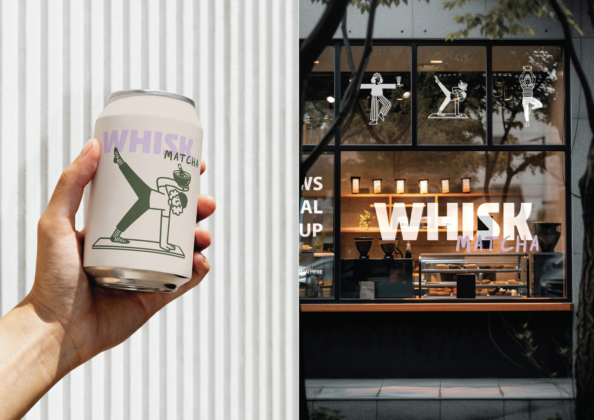
The Result
Whisk is a brand you want on your kitchen bench and in your hand on the way out the door.
Approachable, personality-packed, and designed to turn everyday moments into small rituals.
Approachable, personality-packed, and designed to turn everyday moments into small rituals.