Meet REVO
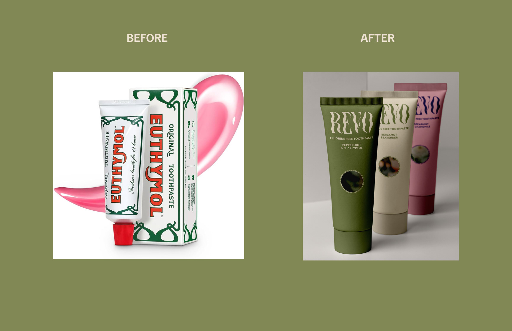
REVO is a rebrand of Euthymol, a century-old British oral care brand. The project repositions the brand for health-conscious rebels drawn to bold flavours, botanical ingredients, and non-traditional oral care.
The Brief
To disrupt a conventional category by creating an unapologetic, sensory-led brand that challenges the norms of traditional toothpaste while respecting Euthymol’s heritage.
The Solution
REVO balances rebellion with integrity. Bold design, confident messaging, and a multi-sensory approach create an invigorating experience that feels modern, disruptive, and empowering — before the product is even opened.

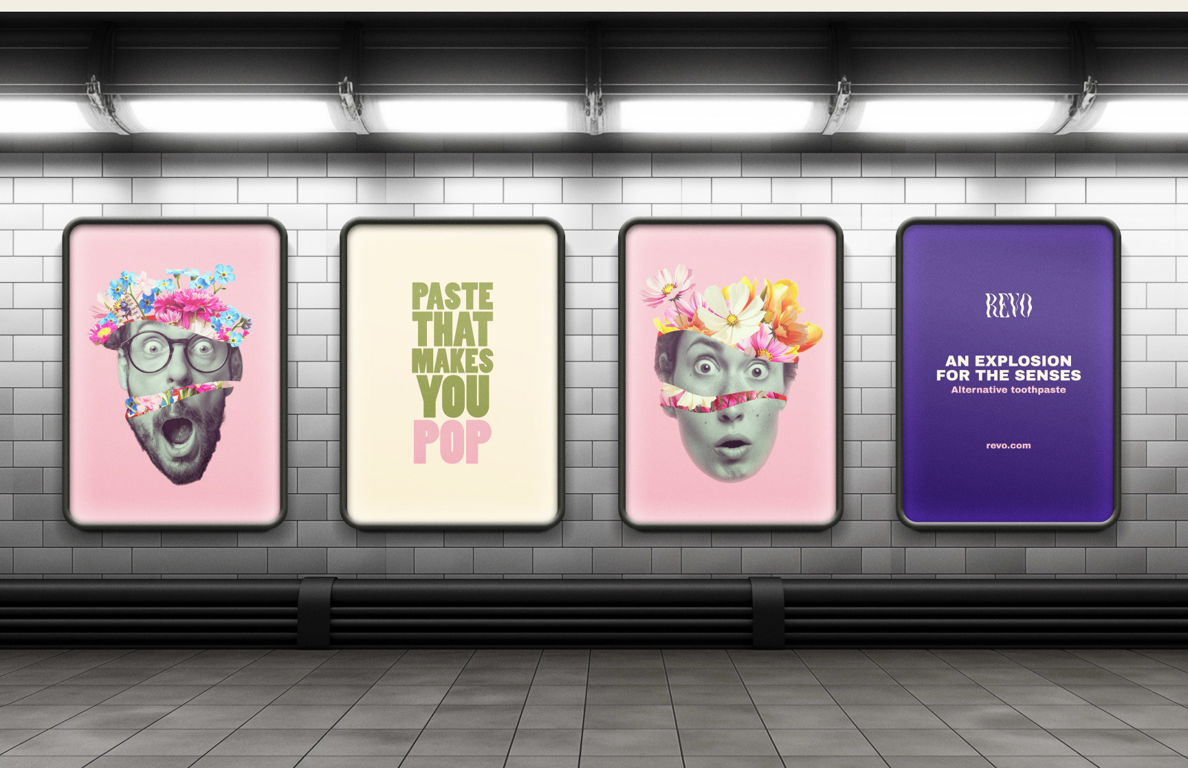
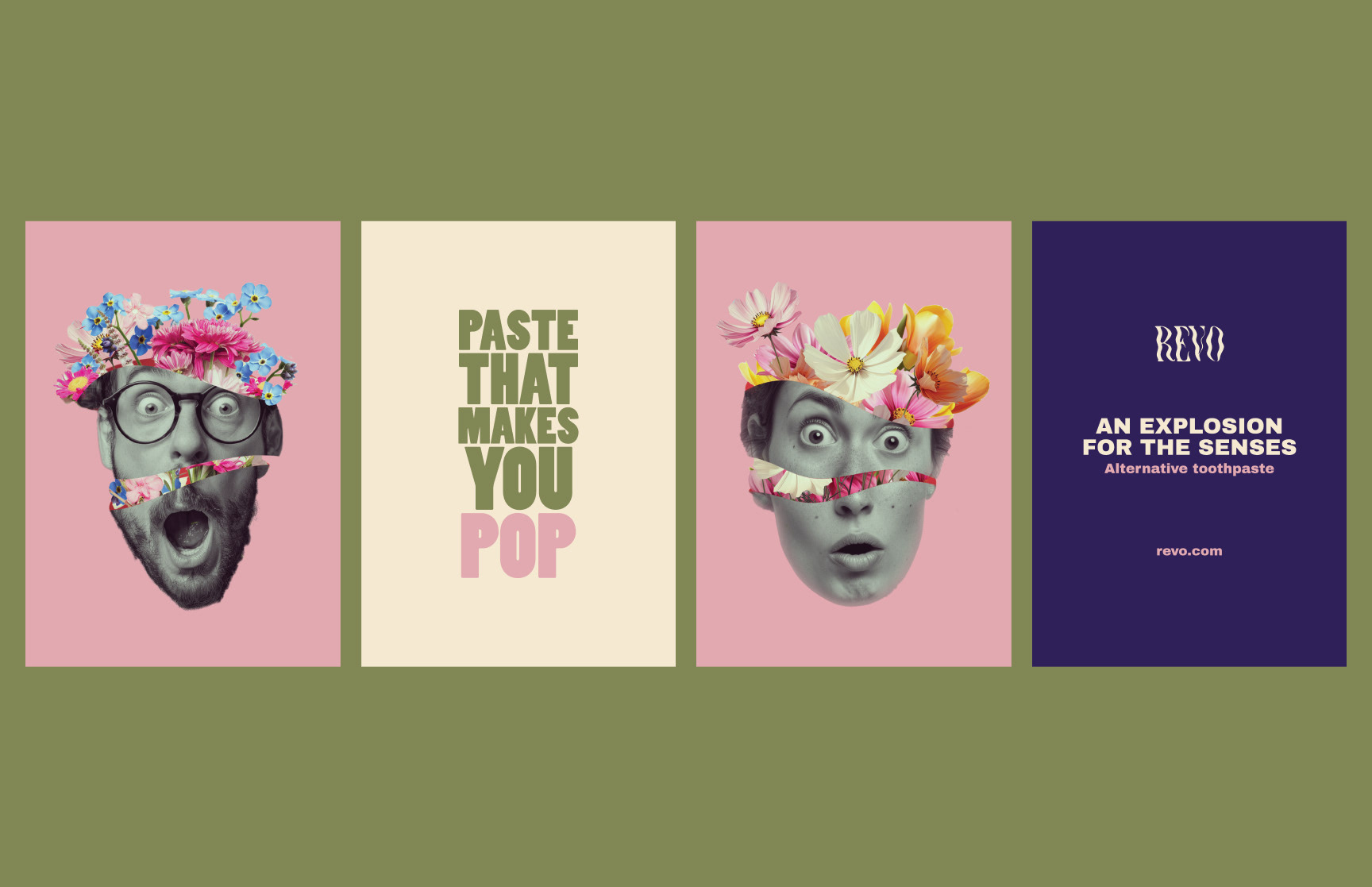
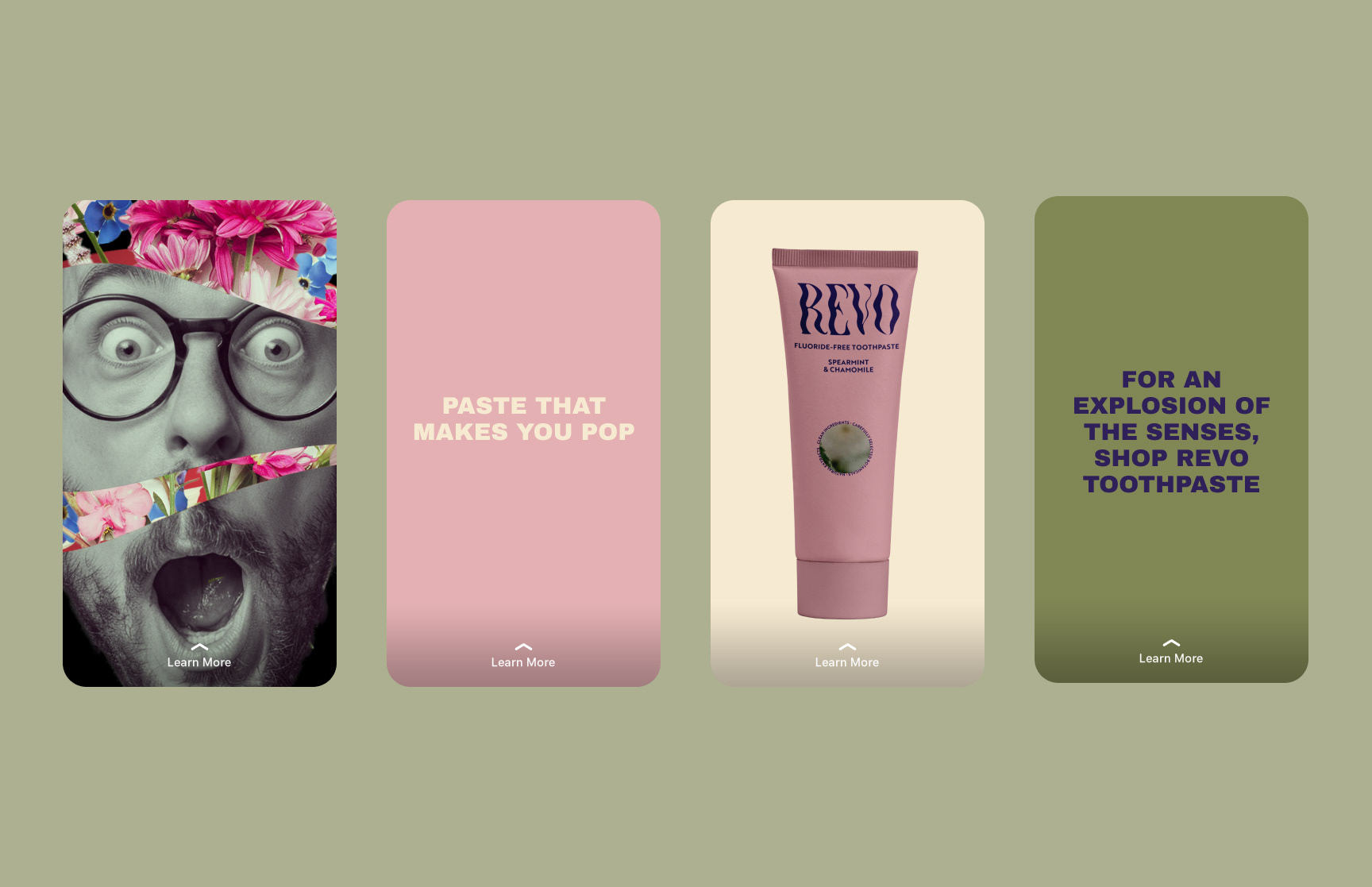
This design evokes a sense of surprise and wonder, symbolising the explosion of fresh, vibrant flavours. It’s intended to provoke an emotional reaction, making the brand memorable and engaging.
On the Tube and other public spaces, these visuals create a bold, dynamic presence, standing out in the busy urban environment and drawing commuters into the brand’s narrative.
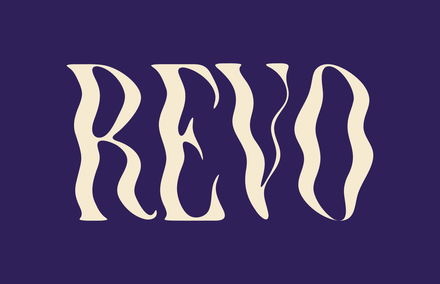
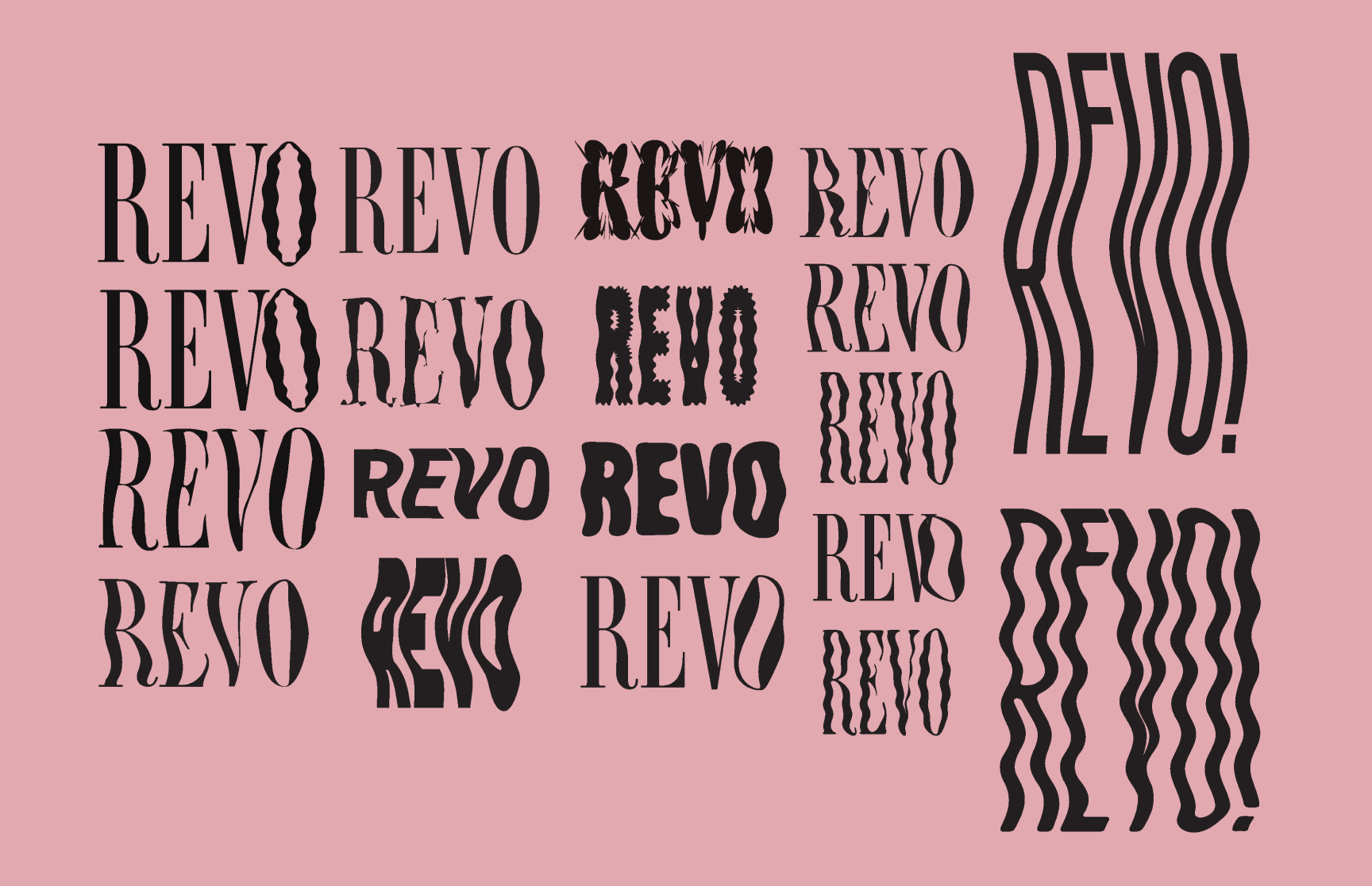
The logo features a warped serif font that balances tradition with innovation, merging a classic typographic style with a contemporary twist. This design choice encapsulates the brand’s evolution, bridging its past with its future, and reinforcing its position as both a trusted and forward-thinking entity in the market.
The packaging prominently features a combination of a circular motif and treated botanical imagery, creating a cohesive visual identity that is both elegant and aligned with the brand’s ethos of natural, high-quality ingredients. This design approach not only enhances shelf presence but also ensures that the packaging resonates with customers seeking something distinct from the crowded, conventional designs of other brands.
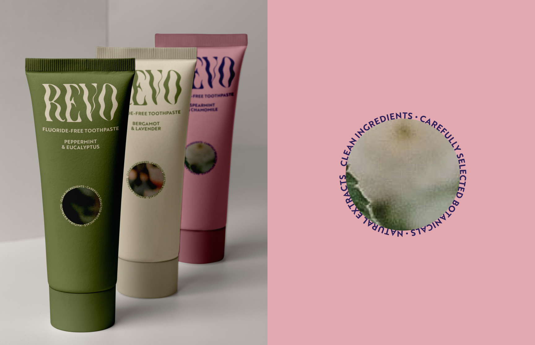
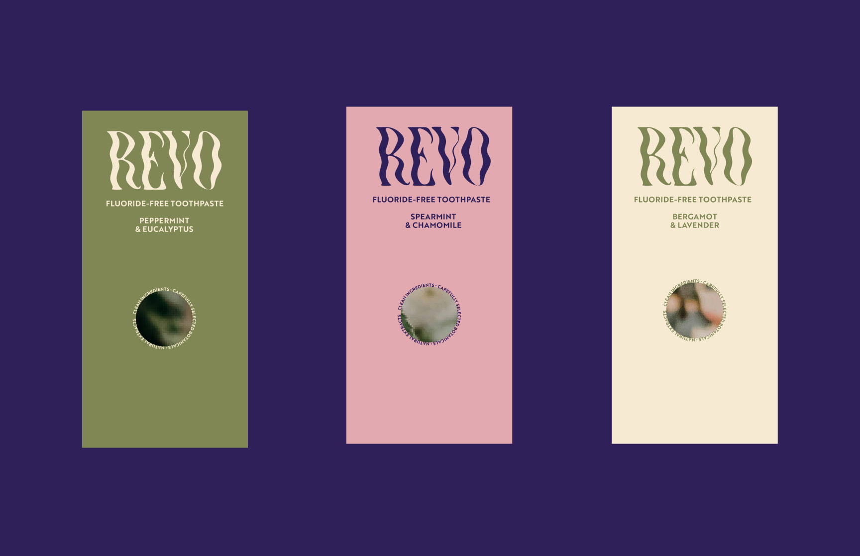
The packaging prominently features a combination of a circular motif and treated botanical imagery, creating a cohesive visual identity that is both elegant and aligned with the brand’s ethos of natural, high-quality ingredients.
This design approach not only enhances shelf presence but also ensures that the packaging resonates with customers seeking something distinct from the crowded, conventional designs of other brands.
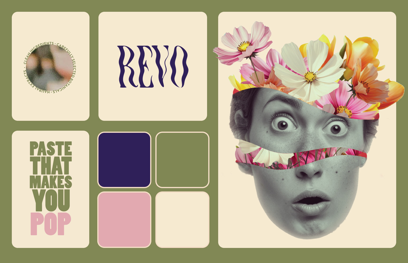
The colour palette pays homage to the original brand, incorporating familiar tones that ensure brand recognition and continuity, while being slightly adapted and pared back for a more contemporary feel.
*Student Project